Alio! Brand Studio0457 064 625Get your free audit

Alio! brand identity and guide

Our logo, Ollie the frog, a colour palette and a brand guide, so the website, the reports and the audit sheet all have a consistent brand look.
  • Our own project
  • Branding
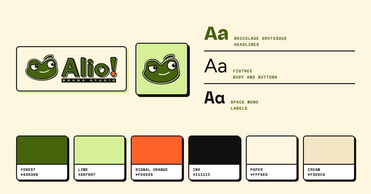
The Alio! logo and Ollie the frog above the three brand fonts and six brand colours, each labelled with its name and hex code.

The brief

As a local digital marketing studio, we needed a consistent brand profile and visuals, no matter where we show up. The website, the monthly report, and our one page audits all need to look like us. We wanted something friendly, a little sassy, easy to view with a mobile and impossible to mistake with someone else’s work.

Building this brand from scratch, we chose the Latin word alio to represent who we are. Alio means elsewhere, and reflects both our desire to look in the places other marketers miss for tactics and strategies that work, and also our desire to take our clients from where they are to the next level in their business. We chose a thick artistic font because we wanted to show how we are unalike from our competitors.

What we made for our brand identity

  • Our logo: Ollie the knowing frog. Named “Ollie”, he’s our mascot logo. Appearing on the website, audit and thank-you pages. We chose to use a mascot because of the evidence. System1’s analysis of the IPA DataMINE database found that campaigns built around a brand character (what System1 calls a fluent device) were 27% more likely to increase customer gains and 30% more likely to increase profit gains than campaigns without one. A 2021 study by the Moving Picture Company found that long-term campaigns with a character increased profit gain by 34.1%, against 26.2% for campaigns without. We’re an evidence driven agency. If we can see something that works that the industry has missed we feel an ethical duty to do right by our clients and implement what works.
  • The palette. Forest and Lime carry the brand, black Ink for text and outlines. These colours represent fresh growth. We chose Signal Orange for the buttons and calls to action. The contrasting colours drive attention to our call to action, while orange evokes warm creativity.
  • Three fonts, one job each. Sans serif Bricolage Grotesque for headlines, blending a relaxed and confident tone with a wonky fun vibe. Sans serif Figtree for reading and buttons so that they’re clean and readable, ensuring a great user experience for people engaging with our content. We liked the blend of geometric details and grotesque style of Space Mono for small labels, calling back to the bricolage heading font.
  • A neubrutalist style. Thick outlines, hard shadows and flat colour. The neubrutalist style was chosen to highlight how we challenge the standard digital marketing industry approaches, and find our clients the leads that anyone else would miss.
Type
Our own project
Client
Alio! Brand Studio
Sector
Local digital marketing
Location
Austral, NSW
Services
Branding
Date
14 October 2026

More projects

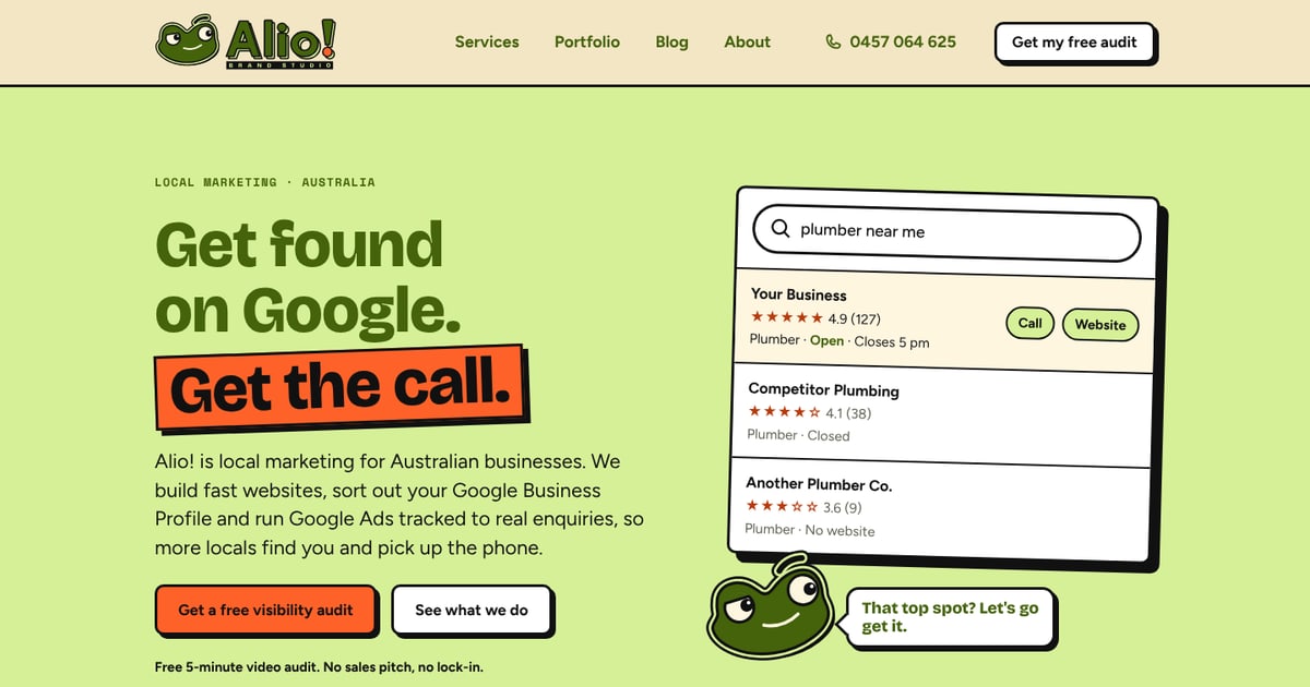
The top of the Alio! Brand Studio home page: the headline Get found on Google. Get the call. beside a mock-up of a local search result.
Our own project

Fast website for Alio! Brand Studio

Our own fast website, coded in Astro, tested for accessibility and set up to track genuine enquiries.
  • Website
  • Local SEO
  • Branding
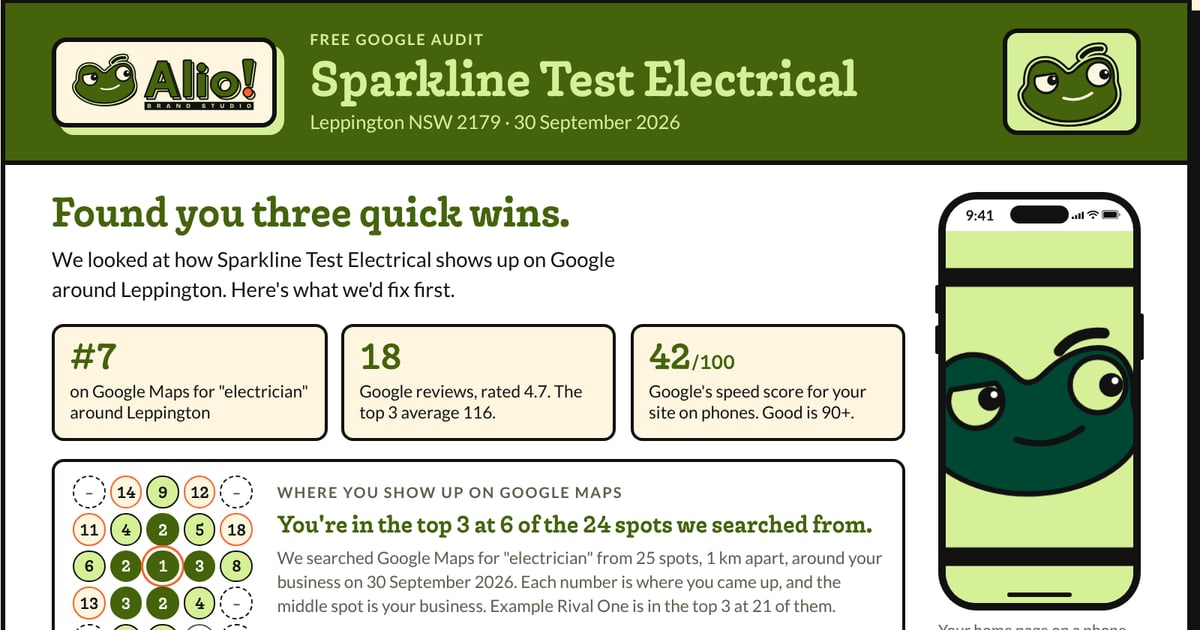
A free Google audit sheet for a made-up business, Sparkline Test Electrical, showing three quick wins, a review count, a Google Maps grid and a phone mock-up.
Our own project

Free Google audit sheet

The one-page sheet that goes with our free Google audit. It shows where a business appears in a grid on Google Maps, how its website scores on a phone and the three quickest wins.

  • Google Business Profile
  • Local SEO
  • Branding

Want to be the next project?

The first 5 website clients get a founding rate, in exchange for letting us write up the results as a case study. Send us your details and we'll start with a free audit.

Get your free audit

Prefer to talk? Call 0457 064 625.